Wednesday, November 16, 2011

Talk like a pirate....

My fingers are all healed and I'm back working, sculpting and sketching away! So hopefully now I'll get back on track with this blog, healed fingers crossed.

Amongst my travels and activities during these few months I've joined a re-enactment group and plan to be a historical pirate! So there will probably be a lot of historical influences showing through in my sketches, and I have no doubt that will also influence my sculpting. First up is a portrait of one of the group's established re-enactment pirate characters 'Pete'. This portrait is taken from a photo so the first thing I did was ask permission to use the photo. That granted, off I went.


I measured the features from the photo and sketched them out at the same size on the blank paper. Again I'm using a Strathmore Drawing pad, with a medium surface and medium weight, a mechanical pencil with a HB 0.5mm lead and a small Crimson & Blake putty rubber, with lastly, a sheet of plain A4 paper to lay over the drawing as I sketch so that I don't smudge the graphite already laid down.


I always start with the eyes, to me the most important part of the portrait, if these don't look right back out at us then the portrait won't work. And I'll return to them constantly, as I build up the shading. I start with the darkest shade of the pupils and plot the highlights in the eyes and then work up the tones around them. I build up the shading gently around the eyes because there is a lot of detail in this small area and I want to capture as much of this detail as possible.


Looking at the photo I'm trying to plot out the areas of dark and light. This will give me the overall form of the face and make the face look more three-dimensional. The lightest point is the tip of the nose and the front tip of the tricorn hat, but the light is reflecting more off the nose so this will mean I leave the paper white and lightly shade in the highlight on the tricorn hat. I also think about the composition of the sketch, and I may push things into the background by making them darker if it suits the composition better.


I realise I have a habit of working from left to right in pretty much all of the portraits I do, not sure what that means, I just happened to notice it. Anyway, to build up the shading I'm using hatching and  cross-hatching lines, both in larger sweeping motions and small controlled strokes. You can see this most clearly around the edge of the hat and face. I'm not blending the lines on the face to make the shading smoother because I want the skin to look slightly rougher, he's an older man (not that old, but older than me!) and he's portraying a pirate so I want some roughness to the portrait. 
A truly amazing artist that uses lines to build up fantastic drawings is Laurie Lipton - to borrow a quote from her website by 'Artweek' magazine “Technically Lipton is a profound draftsman. She captures nuances of light and shade with masterful proficiency.” The size of the image files means they take a while to load, but I promise you it's worth the wait.


I've made the decision to concentrate solely on the face and not add in any detail of the surrounding environment; there's enough expression in the face to hold our interest without adding further information into the sketch. This is also greatly helped by choosing a good photo and having a good photographer who knows how to capture the moment. To emphasise the features and expression of the face at this stage I'll make the shading around the face very dark. It will help give the face more form, push it forward to become the focus and give a little more drama. I'm framing the face with a dark surround but I still have to watch that the overall tones so as not to flatten the form of the face. I'm starting to put in the detail on the chin. This is tricky because there is a lot of dimpling and texture but I still want the focus on the eyes, so I work the two parts of the sketch simultaneously.


The detail is there but it's a little too dark....


...but with a careful  application of the putty rubber I lighten the area until it fits in with the tonal plan of the sketch. With the hat and pipe left to complete I choose to loosen up on the sketch, adding in the shading but not to the same level of detail as the face. I want the face to really push forward in the overall drawing....


And that's it, completed! I think it's a good likeness, an interesting drawing, with just the right balance of detail and loose sketching and a good portrayal of an 'historical' pirate. Arrr!


Friday, September 2, 2011

Fantasy Fish continuing development....

It's around 2 and a half weeks since I broke my finger on my drawing hand but thanks to a hand specialist doctor I've made considerable progress in the recovery and use of my hand. I won't be able to sculpt for a while yet because the compression pressure on the tip of the finger is too painful but I can gently hold a pencil and sketch. So today I returned to sketching fish in the hope of developing a striking image of a fantastical fish. Using a combination of my right and left hand I was able to continue roughly sketching out ideas.


Sketching in a loose flowing manner helps loosen up my wrists as well as capturing the feel of movement that I may incorporate into the final drawing. I'm interested in using fins to suggest movement hopefully without taking away from an overall grotesque look for the fish.


I am definitely drawn towards a large, fang-ridden set of jaws! I want this fish to be ugly and menacing.


I sketched and re-sketched the shape of the head and jaws to try and develop an overall design for the fish.


By re-drawing the fish it helps to establish elements of the design that are essential, the large eyes, the strong, teeth-infested jaws and an almost sullen expression to the creature.


Some sketches show what will work and some show what won't. The front view below is definitely not menacing! And the eye on the sketch below, on the right, is just too low, the fish ends up looking a little stupid.


But I am really interested in building in a sense of movement. Drawing the fish from above makes this easy but I want a face-on view. Maybe there could be more than one fish in the final image...


So below is one of the first sheets of quick sketches trying to develop a fantasy fish.


I'm still a long way off from the final design of the fish, so there'll be more sketches to come before I start sketching the final image. I'm not in a great hurry to finish this one, especially as I'm still hampered by not being able to use my right hand effectively and my left hand is not disciplined enough to achieve what's developing in my mind's eye, but at least I'm still sketching!

Friday, August 26, 2011

Fantasy Fish Continued...

Inspired by my growing ability to draw with my left-hand while my right-hand repairs itself, I decided to go back to sketching details of various fish with the intention of creating a fantasy fish looming out of the darkness. I'm using details of any fish that catch my eye, as yet I don't have a definite plan for what I want to create, I'm simply letting my interest and my observation sketches guide my imagination.


There's something fantastical about flying fish even before you add in any imagination. The bodies are torpedo shaped to streamline them in the water and air but its their fins that interest me.


They almost have a tattered look with transparent panels that look like holes in the fin. By sketching the fin it helps to lodge the image and details in my mind, more so that just by looking at the image, and hopefully will allow a stronger idea to develop in my imagination. That's the plan, and from experience it usually works!


So it seems fins are the attraction for me today!


I do like the overall shape of the Angelfish aside from their fins; it's a very geometrical shape, great for a starting point for creating something new. Another detail I picked up on was the eye. It was black and red with a black strip running down the centre of the eye, something I think I'll develop and incorporate.


Japanese Fighting fish have very dramatic fins, very elaborate, delicate-looking and flowing almost like silk, which belies their aggressiveness. I like the juxtaposition of visual qualities and the character of the fish, again something I want to incorporate, which will be a challenge to do in just on image. 

I'm starting to get some ideas of how this fantasy fish may appear, hopefully my left-hand won't let me down and I'll be able to express my ideas clearly on the paper. The next step is sketching out some of the initial ideas and not being able to sketch quickly in my usual practice with my right hand will prove a real challenge!

Wednesday, August 24, 2011

Mastering Left-handed Sketching!

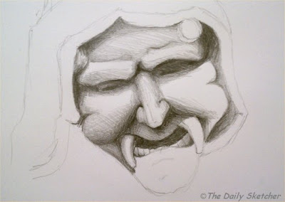
Well 'mastering' may be too strong a word but I have managed to finish my first sketch done with my left-hand. Having injured my right I'm endeavoring to continue my quest to sketch daily, now with my left hand, although admittedly at the moment it's more like once or twice a week! Not deterred by this, today I finished the left-handed sketch of one of the gargoyles from Merton College in Oxford. I've been using my favoured mechanical pencil and my Strathmore medium surface sketchpad.


Taking another look at the sketch I realised that the tonal values were not broad enough, I needed to have more tonal values and a greater distinction between the lights and darks. To do this I went back over some of the areas I'd already shaded and darkened some and then used the small eraser on the end of the mechanical pencil to gently lift off some of the lead in the lighter areas. Usually I would use a putty or kneadable eraser to do this but the mechanical pencil is all I have to hand and to be honest, it does an okay job given that my left-handed sketching is no Rembrandt!.


So hopefully you can see the difference in the tonal values between the two images. I think it makes the form look more solid. I'm still having to turn the sketchpad regularly to be able to shade at a more comfortable angle but I'm noticing that I have a little more control over the fluidity of my wrist movements so I'm not turning the pad as much as yesterday. Another noticeable difference in the sketch itself to those done with my right hand is the pencil marks are more visible; by that I mean the blending is rougher and so you can see the individual marks that make up the shading more easily.


I'm leaving the sketch as it is at this stage, I think to sketch in the hood would lose the form of the face as the tonal values are way too similar. It could be that my brain and my left hand are a lazy and easily bored combination and I want to go onto a new subject! On the whole I'm very happy with the results and well on my way to mastery!

Learning to be a Leftie

Disaster struck this week. One of the worst things for any artist - I broke my index finger on my right hand. I didn't just break the bone, I managed to get the finger crushed as well, so my right hand is pretty much out of action. I can just about hold a pen to write my name, yep, I'm right-handed, but it's so uncomfortable that sketching with my right hand for the next week or so is out of the question. So today I'm learning to sketch with my left hand. I have had to do this before, many many aeons ago when I was a student and badly cut my right hand (me, accident prone?!) but it wasn't a skill I kept up so I'm back to square one.

So to make life a little easier on myself I've chosen to sketch one of the gargoyles from Merton College in Oxford. The reason for this is that the weathering of the stone face gives it a softness and simplicity of form that should hopefully make it easier to sketch given that my left hand is not used to even drawing a straight line, let alone creating fine detail.


It takes me easily twice as long to sketch the basic composition of the face than it would normally do, but with patience and perseverance I mange to render a pretty good likeness.


I can see already that things are a little 'off' from the original, the nose is not quite the right shape, the eyes are too simplified and I've got one of the fangs slightly too far out, but on the whole I'm impressed with my efforts so far. I'm discovering that as I'm thinking about sketching the lines my right hand is almost twitching to get at the pencil and paper. It's a very strange sensation. Maybe it's the frustration of not being able to effectively control my left and produce the fluid lines I'm so used to. Or maybe my brain's just lazy and wants the easy road!


Adding the shading means that I am constantly turning the sketchpad around to an angle that seems to suit my left hand best. I can go one way smoothly but not the other, so turning the paper allows me more control over my shading.


I'm planning on finishing this sketch tomorrow, although getting to sketch daily is not proving possible at the moment, it's something I really miss now when I don't get to put pencil to paper. By this stage of the sketch I'm almost 'in the zone' and don't even notice the time passing although I do find when I've stopped that I'm a little tired. It's not easy but it's definitely a challenge that I'm going to enjoy and hopefully I'll see significant development in my new leftie skills!

Thursday, August 18, 2011

Fantasy Fish

Many influences feed into my art work, whether it's sculpting or sketching, and amongst those are television programmes and movies. I particularly like the Discovery Channel and so with this influence today's subject is fish. My end goal is to create a fantasy fish so to feed my imagination I take several images of fish that I find interesting, even if some are more than just a little peculiar, and sketch the parts that created the interest. For example, I started with the Handfish, so called because it looks like it has hands...


I'm not concerned with the rest of the fish, just the 'hands' but the patterning is striking and I may incorporate it so I put that into the sketch as well...

 Next is a fish I don't know the name of but it's fierceness in its appearance attracts me...


Already I'm starting to conceive a deep water creature looming menacingly out of the dark and although no ideas are set in stone yet I'm probably leaning towards reference material that will support that type of fantasy creature.


I love the name of this one, Sea Dragon, which sends my imagination off on another idea! I'm sticking with the prehistoric looking fish and just by observing and sketching them it helps create images that my imagination can use to create a new and weird creature.


There's definitely something gothic or macabre about my choice of fish to sketch but I think they are a rich starting point for hopefully developing a strong fantastical image. I will keep sketching and building my own reference of images in my imagination until I have a strong sense of the drawing I want to create.

Wednesday, August 10, 2011

Fantasy Head - Skull with Horns - Finished!

Finally, today I got back to the fantasy drawing I've been working on for a while. I've been letting the sketch take me along with it rather than carefully planning out the whole concept before I started. So today I decided at the last minute what exactly would go in the skull's mouth.

First I had to finish around the mouth, this is where I left off last time...


Blending the new pen lines in to the old part of the sketch can be a challenge; applying too much pen will change the overall tones of the drawing, so I apply the pen very lightly, allowing me to carefully build up a shade to match the pen already laid down days ago.


With the white of the paper showing through in the mouth you can see just how dark the whole image is, which is the effect I wanted, the use of extreme light and dark (chiaroscuro) to create a dramatic form. The writing inside the mouth had been to put a reptile inside the open jaws but I couldn't think how to update this much-used image so I chose another creature...


... a rat. I still wanted to make a reference to something sometimes considered creepy or repugnant, to keep the imagery dark or sinister. The challenge is to create a visible image whilst still maintaining the correct shade values, the rat would be in deep shadow but still needed to be seen.


By creating the deep dark shadow in the mouth surrounding the rat I'm able to determine the shade values of the fur so that the rat is withdrawn from the light but still visible. I decided to leave a sharp highlight in the eyes, I'm sure the focus of the picture will be divided between the skull and the rat in the balance that I'm after.


I think the rat head looks good but it's still a little bright and so the focus shifts onto it too easily, it's distracting. It's at this stage I realise I've forgotten the shading in the left cheekbone, doh!


So having shaded in the cheekbone and darkening the rat's head but leaving his eyes sharp with a bright highlight I think I've got the balance right. I'm happy with how the whole image works and I've finally finished!

Thursday, August 4, 2011

Fantasy Head - Skull with Horns Part 3

Today I was back sketching on the fantasy head I started almost a week ago. I sketched the head's outline with a mechanical pencil using a 0.5mm lead on a Strathmore Drawing pad with a medium surface. I then started to fill in the shading to create a three-dimensional image using a black Biro pen.


I've been sketching this image without any definite plan, just going with the flow up until now but I had decided I wanted the image to use chiaroscuro - the dramatic use of light and dark to create the perception of solid form, so the darkness of the black pen seemed ideal. You can see as well that I've been playing with the idea of something being inside the skull's open mouth; I often make notes on my drawings so that I can remember the ideas I've had.


I'll need to fill in the background to create the sense of darkness to offset the light hitting the head. And there's a lot of background! If I use anything other than the same pen I think it will look odd so I'll have to persevere. I could add some faint detail to break the background up but I think I'm going to keep it simple.


The texture of the horns has to look different from the texture of the skull, so I make different marks with the pen, more scoring than gentle shading, although when I have built up the detail I do go over the whole horn lightly with the pen to reinforce the form with shading.


Most of the detail is built up with hatching and cross-hatching pen lines, often then blended to hide those lines but at this stage the hatching lines are clearly visible. I'm also laying a sheet of paper over the sketch, only revealing the section I'm working on so that I don't smudge the pen's ink and ruin all that work!


The form is really starting to come out from the paper now. I may make the shadows darker, I'm not sure yet. My plan now is to complete the detail over all the paper and then see how the shading values play out together before I start darkening any of the drawing I've already done.


So I'm going to complete the other side of the head and the other horn and then I will fill in the detail in the mouth. I'm doing it in this order because I'm still not sure about what will go inside the mouth so it'll give me a little more time to decide. There's so much more to do but it'll have to wait til another day!

Tuesday, August 2, 2011

Fantasy Head - Skull with Horns Part 2

It's been a few days since I've been able to pick up my sketchbook and any kind of drawing implement but thankfully I was able to get back to the fantasy head I previously started. I never really had a plan for this drawing, I just wanted to sketch and let the ideas flow.


I decided to break up the symmetry of the image and sketch a shorter horn on the left. I also wanted the horn to twist at a different angle making it look more natural. I've been sketching the image with a mechanical pencil, laying a sheet of paper over the sketch so as not to smudge it.


I like the asymmetry of the horns and it doesn't detract from the overall image, I think it strengthens it by adding more interest. The head does look a little 'empty' though, I think it needs some eyes to give it more character.


I'm not worried about the anatomical accuracy, the fact that the eyeballs are floating in the sockets, it's the imagination behind the image that's important to me. I am aware that the eyes do need to look like they belong to the skull though, that it can actually see, rather than it looking as if the eyeballs have just been placed into the skull.


I'm not sure about the development of the teeth, but at this stage I'm going to leave them as they are now and come back to them later and decide then.


From the outset I've seen this head in my mind's eye in a very dark setting with a strong light, probably influenced completely by my love of chiaroscuro - the strong contrast between light and dark creating a strong sense of three-dimensional form and drama. I love the eyeball - it looks really solid, like you could pick it up with your fingers!


Using a black Biro pen I create hatching and cross-hatching lines with a light touch on the paper where the light hits and building darker and darker layers of lines where the shadows are deepest. The white of the paper is left bare where the light is strongest.


I still haven't finished sketching the details on this image, I'm still deciding what will fill the open mouth, but the shading I've added has no impact on that part of the sketch. There's a lot of work still to go into this drawing but time's not being kind to me at the moment! I shall return to it another day.