Showing posts with label male. Show all posts

Tuesday, February 18, 2014

Carl's Portrait Finished!!

Okay, this could be a mammoth post - the portrait is finished, and there's been a lot of work done since the last post... so, here goes...

With the main part of the face almost complete, I start work on the hair, the beard, and the helmet Carl is wearing as part of his re-enactment costume.


The hair is built up much in the same way as the mustache; deliberate pencil strokes put down in the direction of the strands of hair themselves. All the time I'm adding pencil marks, I bear in mind where the light is hitting the hair and make sure to lighten the pencil strokes in this area.


You'll also note I have a sheet of paper that lays on top of the drawing - this is to stop my hand smudging the pencil that's already down on the paper as I work on the other side of face. Carl's hair is dark, and as this part is on the opposite side to the intense sunlight, it will be the largest dark part of the image. To make sure I don't go too dark, I start work on the metal helmet he's wearing. By working round the whole image like this I can make sure that one part doesn't become too dominant in the balance between light and dark, thus keeping the focus on the main part of the face.


I mentioned in the last post about using a Q-tip or cotton swab for blending the pencil to create a softness, and I use this method quite heavily in the creation of the helmet. I need to ensure the helmet has a different textural look than to the face and hair. The metal, although dented and scuffed a little, is still smooth and somewhat reflective, so I carefully blend the pencil and add detail to create the smooth but worn look of the metal.


With the metal helmet pretty much done I go back to the hair. Finding the balance on both sides of the face is very important; by that I mean the overall composition of the portrait. The composition is the placing of the dark and light elements around the image. If one side of the drawing is too dark or too light that it makes your gaze go to just that part, then the drawing has failed. I need to make your eyes move fluidly around the drawing, seeing the focal point first and then comfortably moving around the detail, taking in the whole image, until you are drawn back to the focal point.


The left side of the drawing is pretty easy to work on; there's no direct sunlight on the hair, so I just need to capture the texture of the hair, but it's a totally different story on the other side of the face...


...the sun is highlighting the hairs on Carl's beard. There's two ways I can deal with this. One is to create the beard and then lift off the pencil marks to create the highlights with a putty rubber. But the detail is too small for the putty rubber and it lifts off too much of the surrounding pencil. The other way is to keep the paper white in the areas of the individual hairs. Again, the detail is small, so I carefully put down the marks for the beard whilst trying not to block out the white paper where I want the sunlit hairs to be. This takes time, patience and a very steady hand!

But bit by bit the beard is created, and after stepping back several times to take an appraisal of the drawing, I reach the point where the portrait is finished...


It's a successful portrait. It looks like him, I've illustrated the sunlight on his face, I've created realistic detail in the skin, hair and metal of the helmet, and I've retained the focal point whilst still creating areas of interest around the whole face and I don't think it needs anymore work. I think Carl will be happy with it too.


Friday, February 7, 2014

Carl's Portrait continued...

Work is just crazy busy at the moment so I was only able to grab a short while to sketch on Carl's portrait; here's where I left off from before...


The face is lit by bright sunlight, coming from the right hand side of the image, and I'm trying to keep that sense of warm sunlight flooding the face. So each stage of tonal build-up is carefully done, so as not to darken the whole portrait too much.


Using the mechanical pencil I very lightly start adding lines to build the form of the nose. To soften any lines that I don't want showing I use the end of a Q-tip or cotton swab, very gently rubbing the pencil to blend and soften the marks, but always being aware of where the darker build up of pencil is going; I don't want to distort the look of the nose. As I'm blending, if there's too much pencil on the Q-tip I just grab another one. There are different tools you can use for blending; I just find the cotton swabs easiest and they're cheap and plentiful.

When I've done some work on the nose I move back to the forehead.


Again, I'm laying down a subtle layer of pencil and blending using the cotton swab. Any excess pencil that builds up I carefully remove with a putty rubber, and then gently blend again. I move around the face this way, building tone and form a little at a time, so as not to overload any area of the portrait with too much dark pencil. I need to retain that feel of sunlight, so doing a little at a time works best for me.

That's all I've got time for, the sculpting is calling, so this'll have to wait again til tomorrow!


Thursday, February 6, 2014

Quick Face Sketch.

Have you ever had iritis? I hope not 'cos it's a painful inflammation of the iris and boy, it's no fun! The last few weeks have been a bit of a challenge to both rest my eyes and stay on top of my workload. Something had to take a back seat so I haven't been sketching for a while. But my eyes are well on the mend, so I picked a pencil back up for a quick little sketch...


I took some photos of a guy I met recently and will be working on a portrait of him very soon, but I wanted to take a better look at the images I've got and have a closer look at the face. Drawing from observation is a skill that needs practice; taking time to really look at the lines, shapes, and details of the face instead of glancing and working from whatever made it into your memory. Really looking and studying the face is like exercising a muscle, it takes effort and discipline, but the rewards are a much better drawing, so it's worth it!


At this stage I'm making a loose sketch of the shadows that define the form of the face, and checking whether I'm capturing the correct shape and proportion of the face. I'm using a mechanical pencil on a cheap cartridge paper, this will not be part of the portrait, and as it's just a practice sketch I'm not using my best paper.


I can see by this stage, that although the face in itself looks fairly realistic and believable, it's not an accurate representation of the guy. I've made the nose too small, I think you can see the original line almost ghosting the nose, but I let myself be tricked into thinking it would look too big. As I said, drawing from observation is a skill that needs to be practiced!
Enough for today, gonna give my eyes a break and work again tomorrow.

Friday, January 17, 2014

Carl's Portrait.

Started work on a portrait of Carl - a lovely guy who does re-enactment, and as it's such a big part of his life it seems only fitting his portrait should reflect his passion, so I'm sketching him in costume.

It starts with a rough outline to get the size of the head and the features in the right place.


With the outline done, as always, I start with the eyes. I'm drawing on a flat white cartridge paper, there's no texture to the paper, and I'm using a mechanical pencil with a HB lead.


The reference image I'm using for the portrait was taken in bright sunshine, and Carl's smiling, so the light and his facial expression makes his eyes seem smaller than if his face was relaxed and in softer light. This bright lighting is going to be a challenge!


Even with the eyes smaller I still need to capture the intensity in his facial expression, so I start right in the middle of the eye. The pupil is going to be the darkest part, but it needs a spot of reflection, a highlight, otherwise the eyes will look flat.


With the darkest part down, I start building up the tonal detail around the eye. The nose guard of the helmet is casting a shadow over the other eye, and blocking out any highlights within the iris and pupil, so this is going to be tricky not to make the eye look flat and lifeless.


I'm using the pencil to make soft cross-hatching marks that blend into each other and I'm building up layers of darker pencil to suggest the 3-dimensional form of the eyes. As I work, I sketch on both eyes, building up each a little at a time so that the tonal qualities work together.


The bright sunlight is on the right side of the face as we're looking at it, and at this stage I'm think of leaving the paper completely white to show the brightness.


So I'm just slowly mapping the tonal changes on the face as it transitions from shade to sunlight. I'm not worried about the range of tonal depth, just mapping the shapes out loosely.


I'm not decided yet, but I'm thinking of making the details around the edge of the face a little out of focus, or more sketchy, so there's more emphasis on the main part of the face.


But it's early days yet, I still have an enormous amount of work to do, and the feel of the portrait may change as work progresses. It's certainly going to be a challenge though!

Thursday, January 16, 2014

Carnival Portrait Finished.

There wasn't much work left to do on this drawing, but it was at a critical point where I could really mess it up. This is how it looked yesterday...


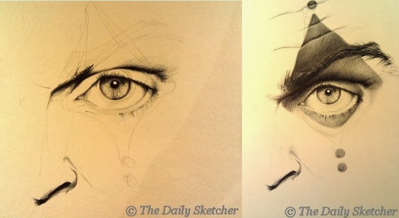
Using the medium black Bic biro pen I continued the gentle build up of layers of pen marks.


I use the word 'gentle' because if you press too hard with the pen you put down a very dark mark that you can't undo, and so everything else around it has to be that much darker for it to blend. In doing this you lose the ability to create the illusion of solid form; you can use darks and lights to suggest the three dimensional form of the eyeball and socket in the face.


So by gently building up layer on layer of lighter pen marks I can create the depth of darkness that I need to suggest the eye as it sits back in the socket, as well as making it look like there's make-up on his face.


Even at this stage, close to completion, I can still get it very wrong. To keep control of the sketch I step back after every few marks and look at it from a distance to check I'm not making one area too dark.


At this point I think I've finished. But after getting a cup of coffee and coming back to it, I realize the bottom of the eye, where the skin of the lower lid covering the eyeball bags a little, it looks too prominent and it's distracting my focus. So I add a few more pen marks to darken it up a little, blending them so the skin looks smooth and soft.


The difference is almost imperceptible, but put them side by side and hopefully you can see it.


It's always worth taking a little time out from a sketch and coming back to it, to see what doesn't quite work. But it's also good to know when to stop! I set out with a loose idea of a sketch, no definite plan, but knowing I wanted to create a face which looked like it had make-up on the skin. I'm happy with this one at this stage and it's a good practice run for a more developed sketch in the future.

Just a quick note: the images on the blog are yellowish in color - this isn't because I'm drawing on yellow paper, but because I'm often sketching in the evening under artificial lights and taking photos with my phone camera and uploading them with only a change to the brightness of the image. This is how the same image looks without the yellowing of artificial light...


Quite a difference! But keeping up with the blog and sketching every day will often mean slightly yellowish images as it's the quickest way to get the blog done!

Thanks for reading.


Wednesday, January 15, 2014

Carnival Portrait continued...

I'd been looking forward to getting back to this drawing, although I'll admit I'm a little nervous about sketching the make-up on the face in case I screw it up, but nothing ventured, nothing gained. So here goes!

I decide to define the eyebrow before adding in the shading for the make-up. Still using the medium black Bic biro pen I start gently adding the strokes of the hairs that create the eyebrow.


I follow the same directions as the hairs when making the marks with the pen, and the hairs go in different directions, overlaying each other, thicker in some places and sparse in others.


It's really just a case of patiently laying down lines to create the mass of hairs, but how you apply pressure really matters when making the marks with the pen - where the hair comes out of the skin needs to be lighter than the other end of the hair, so the pen stroke needs to reflect this.

This character's hair is very dark, and the eyebrow needs to be dark as well, so I continue layering the pen marks, still paying attention to the direction and thickness of the hairs.


Once I'm happy with that, I move back onto the shading around the eye, but not because I'm still trying to avoid the moment when I start the make-up! I need to plan how the make-up will sit on top of the skin and so I need to define the detail under the eye first. This is an older character, with lines and slight bags under his eyes so I lightly shade those in and then start adding the make-up.


As I add the make-up I follow the highlights and furrows of the skin.


Slowly, I work down the face, adding the carnival make-up detail, all the while checking the depth of shading on the overall face so that the drawing stays in balance. The shading around the eye needs more attention as I add the darker layer of the make-up, so as to not lose the form of the eyeball and socket.


Time has gotten away from me, and I'm not going to get this finished today, but I'm happy with the sketch so far. It doesn't seem like I've done much work when you compare it with yesterday but building the shading takes a lot longer than it seems.


It's looking good. Let's hope I don't mess it up tomorrow; you can't erase pen lines!


Tuesday, January 14, 2014

Picking Up Where I Left Off...

Time to resurrect this blog; work is crazily busy and so now it's more important than ever that I find time out each day to sketch for pleasure rather than just designing for work. It also helps that over the festive season I bought myself a gorgeous new drawing board and have been itching to get started with it!

The first sketch has no definite plan, I've just taken a reference image of an eye and sketched it roughly out using a mechanical pencil with a HB 0.5mm lead on Daler Rowney Cartridge paper which has a smooth surface.

 At this stage I'm not going to draw the whole face - this is really just a practice run, getting my hand back in, so I'm just focusing on a small part of the face and working on my control to build detail.

Once the image is roughly sketched in pencil I start using a different drawing tool, a black Bic medium biro pen.

 Most people just use these pens for writing but I love drawing with them. They can be used in a similar way to a pencil, creating soft shading and dramatic light and dark effects, but I have a habit of smudging pencil, and I find the pen work much cleaner.

So, in the same way I would if I was using a pencil, I start to define the dark areas of the eye.

My pencil lines provide a guide, once the pen mark is down on the paper there's no going back so the rough pencil sketch really helps at this stage.


The iris of the eye in the reference image is a pale color so I have to keep the pen marks in the iris to a minimum whilst still trying to make it look realistic, but when I reach a point where it looks okay I leave it and move on to the surrounding area of the eye. I can always come back to the iris later if it looks too pale but if I over-work it now the whole image will fail.

 As I said at the beginning I don't have a definite plan but I will be doing a series of carnival character portraits in the future, so I'm thinking of trying some carnival make-up on this image. I need to extend the image to allow for that, so I add in the nose.

I don't need to sketch the whole side of the nose in, because at this stage the light and the dark shadows are suggesting the form for me. With a tiny bit more shading on the nose, I return to work on the eyelid.

The eye needs a lot more work but I'm starting to think about how the carnival make-up will sit on the skin so I've sketched out a rough pattern and I'll work on that tomorrow.

Wednesday, November 16, 2011

Talk like a pirate....

My fingers are all healed and I'm back working, sculpting and sketching away! So hopefully now I'll get back on track with this blog, healed fingers crossed.

Amongst my travels and activities during these few months I've joined a re-enactment group and plan to be a historical pirate! So there will probably be a lot of historical influences showing through in my sketches, and I have no doubt that will also influence my sculpting. First up is a portrait of one of the group's established re-enactment pirate characters 'Pete'. This portrait is taken from a photo so the first thing I did was ask permission to use the photo. That granted, off I went.


I measured the features from the photo and sketched them out at the same size on the blank paper. Again I'm using a Strathmore Drawing pad, with a medium surface and medium weight, a mechanical pencil with a HB 0.5mm lead and a small Crimson & Blake putty rubber, with lastly, a sheet of plain A4 paper to lay over the drawing as I sketch so that I don't smudge the graphite already laid down.


I always start with the eyes, to me the most important part of the portrait, if these don't look right back out at us then the portrait won't work. And I'll return to them constantly, as I build up the shading. I start with the darkest shade of the pupils and plot the highlights in the eyes and then work up the tones around them. I build up the shading gently around the eyes because there is a lot of detail in this small area and I want to capture as much of this detail as possible.


Looking at the photo I'm trying to plot out the areas of dark and light. This will give me the overall form of the face and make the face look more three-dimensional. The lightest point is the tip of the nose and the front tip of the tricorn hat, but the light is reflecting more off the nose so this will mean I leave the paper white and lightly shade in the highlight on the tricorn hat. I also think about the composition of the sketch, and I may push things into the background by making them darker if it suits the composition better.


I realise I have a habit of working from left to right in pretty much all of the portraits I do, not sure what that means, I just happened to notice it. Anyway, to build up the shading I'm using hatching and  cross-hatching lines, both in larger sweeping motions and small controlled strokes. You can see this most clearly around the edge of the hat and face. I'm not blending the lines on the face to make the shading smoother because I want the skin to look slightly rougher, he's an older man (not that old, but older than me!) and he's portraying a pirate so I want some roughness to the portrait. 
A truly amazing artist that uses lines to build up fantastic drawings is Laurie Lipton - to borrow a quote from her website by 'Artweek' magazine “Technically Lipton is a profound draftsman. She captures nuances of light and shade with masterful proficiency.” The size of the image files means they take a while to load, but I promise you it's worth the wait.


I've made the decision to concentrate solely on the face and not add in any detail of the surrounding environment; there's enough expression in the face to hold our interest without adding further information into the sketch. This is also greatly helped by choosing a good photo and having a good photographer who knows how to capture the moment. To emphasise the features and expression of the face at this stage I'll make the shading around the face very dark. It will help give the face more form, push it forward to become the focus and give a little more drama. I'm framing the face with a dark surround but I still have to watch that the overall tones so as not to flatten the form of the face. I'm starting to put in the detail on the chin. This is tricky because there is a lot of dimpling and texture but I still want the focus on the eyes, so I work the two parts of the sketch simultaneously.


The detail is there but it's a little too dark....


...but with a careful  application of the putty rubber I lighten the area until it fits in with the tonal plan of the sketch. With the hat and pipe left to complete I choose to loosen up on the sketch, adding in the shading but not to the same level of detail as the face. I want the face to really push forward in the overall drawing....


And that's it, completed! I think it's a good likeness, an interesting drawing, with just the right balance of detail and loose sketching and a good portrayal of an 'historical' pirate. Arrr!